I have to say, the red/blue maps that you're used to seeing to illustrate how the election is doing for the various candidates don't do much for me. It's hard to pull out what states are most crucial for victory, or how a swing one way or another would change things.
So I've been working on a different kind of diagram, one that throws away geography and instead ranks states based on the latest polling data.
Please do ask me to clarify anything you don't follow about this diagram - thanks!
To make sense of any of this you must understand the Electoral College.
Red states are states that went for Bush in 2004
Blue states are states that went for Kerry in 2004
States to the left of the line are projected to go for Obama
States to the right of the line are projected to go for McCain
The further left or right they extend, the further the projected margin of victory
The thicker the bar for a state is, the more electoral votes it has.
The numbers inbetween states near the finish line mark how far that boundary is from the finish line.
The projected winner is the person who takes the state on the finish line.
Each state also carries a code such as "CA (55) 18%", which means that CA (California) has 55 electoral votes and is projected to go for Obama by a margin of 18%.
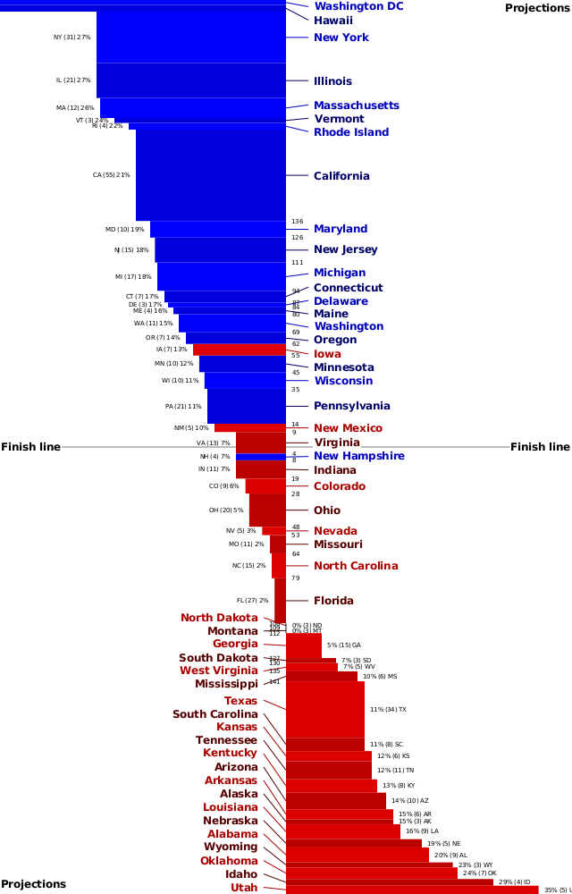
This is based on yesterday's projections from electoral-vote.com. I plan to maintain a related diagram on election night so you can track how the race is going.
If you have any suggestions on how I can improve this, please let me know, and if you think this diagram is helpful or useful, please recommend this diary - thanks!
